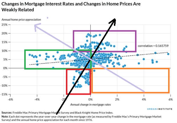
John Hussman uses scatter graphs, and if you cheat and tag the dates onto the blue dots, you can really move up your game. This chart is a plot of annual home price appreciation and annual change in mortgage rates. (All we know is how much they change not where they were to begin) The correlation number (.165759) is what happens when a left brain analyst has to make the call. Now to deconstruct this formulaic response, I make some visual notes.
The lower right quadrant (orange) is almost empty, there is only one data plot where the annual change in mortgage rates is greater than zero and homes prices depreciate. If you think long term yields can rise here, your home equity looks pretty safe.
There is a small cluster of events where home prices were falling, and mortgage rates were also dropping, (red). All instances of home prices falling represents an outlier, which is to say, not entirely trustworthy, but we can fix that perhaps.
I connect the (black) line between the (red) box and the (purple) box which are outliers in this new implied distribution and the narrowest part, is bisected by the (lavender} line, would be an approximate distribution center.
The (lavender) line (home price appreciation implied) has a complementary relationship to the (black) line, (mortgage rate change) which also raises the zero line on home appreciation at neutral mortgage rates. We need to appreciate that home prices and mortgage rates are not mutually exclusive categories, they tend to measure the same thing. There are statistical routines which isolate the factor, for the moment we can just keep that in mind.
Most mortgage rate changes are nominally in the +2-2% range, (whereas the range in home price appreciation is skewed positively, +20% to - 10%) while annual home price appreciation in that range of plus or minus 2% mortgage rates, is between 0 and 10%. Most everything is happening in that region of the chart.
Our adjusted chart supports the logical outcome that higher mortgage rates have on housing. (Higher home prices tend to push mortgage rates higher). The difficulty with this chart is that rates are mostly falling during this period. The distribution in the (purple) box confirms the skew toward higher home prices at higher mortgage rates.
Now anything to the left side of the (black) line is where the implied change in mortgage rates is less than zero. This is important when we look at the data in the (red) box which is to the left of the (black) line. There are far fewer plots on the left of the (black) line, or the negative mortgage rate side, where home price appreciation is less than zero. The (black) line bifurcates out a lot of the data inside the (red) box associated with negative mortgage rate changes..
Furthermore the highest implied gains in home prices (above the lavender line) occur at the higher levels of mortgage rate change. Simply turn the graph of the (black) line and the (lavender) line until they are vertical. Higher mortgage rates correlate to higher home appreciation which is what the correlation is telling us. In a rising yield environment (or more normal market) we should start to see more instances of rising mortgage rates.
While the (black) line shifts toward the right the data plots where home appreciation is below zero lessens. The (lavender) line should move higher, while more positive data points are being added. It's also worth considering how the relative position of the (orange) box shifts to fit into the lower right quadrant of intersection. This is the sweet spot where home prices almost never go lower.
Several other tailwinds may provide lift to Real Estate market. NAR ended the old 6% commission, and some mortgage lenders are thinking of dropping Title Insurance. There is a push to deregulate Real Estate. This is similar to the moment when electronic trading came to the NYSE, it provided a shot of liquidity. The Real Estate market is being securitized; MBS, and now ETFs which trade the market, all provide liquidity.
By inference the weak correlation should become stronger, nearer .45, while the correlation is higher and the implied bias is toward higher mortgage rates then home appreciation should rise. To sum we have been in a housing bear market since 2008 and we are now only starting to come out of it. Rising bond yields tend to support rising home prices. The premium between mortgage rates and bond yields is very high right now, and the reflexive measure is the 10 year bond, while in point of fact 30 year mortgages are a better benchmark. With the current yield curve the 30 year is a lot cheaper.
The affordability issue is one indication that wages have not kept up with rising asset prices. That implies higher inflation and higher interest rates. Then the Fed could drop the rate on EFFR, which would not affect long bond yields as much, but would stimulate more inflation, and put more pressure on home buyers. Consumers to the degree they can accrue savings, those savings will outpace the rate of interest on their mortgage. This puts a negative spin on consumers, who want to pay for a home and enjoy the upscale lifestyle.


